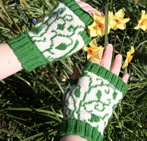
As part of a Ravelry design challenge I've been working on a pair of colourwork mittens. I don't design a huge amount of colourwork. I don't know why because I actually quite enjoy designing it and knitting it but I will confess sometimes it is tricky to find the right combination of colours. Often I take the easy way out and just choose a main colour and contrast it with white or undyed yarn. It's what I did for my Snow Over Leiden hat and my Winding Leaves mitts.
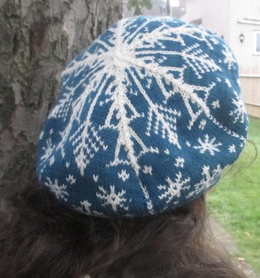
In my defence, Snow Over Leiden was part of a challenge with a winter theme and if you're designing snowflakes there's a strong possibility they're going to be white, but for Winding Leaves I had less of an excuse!
For this most recent challenge I decided I wanted to use three colours, a departure from my usual two for starters. I also decided I didn't want one of them to be white. Finally I wanted to use yarn from my stash. Realistically, for stranded mittens, using sock yarn leftovers was the best option so I pulled out all my partial skeins and started putting them together.
Coordinating yarns in my stash is not difficult. I am a big fan of blue - if I sort my Ravelry yarn stash by colour more than half of the entries are either entirely or predominantly in shades of blue. My difficulty is in finding colours that are different enough to contrast with one another but that will actually go together.
In the end, I put together all the part-balls with enough yardage in them to be useful, took a photograph and then converted it to black and white. That way, the colour of the yarn is less of a influence and instead you see the colour value. The colour value is not about the hue, about whether it is blue or red or green. It refers to the lightness or darkness of a colour, and for colourwork you need colours with differing values that will stand out against one another in a pattern.
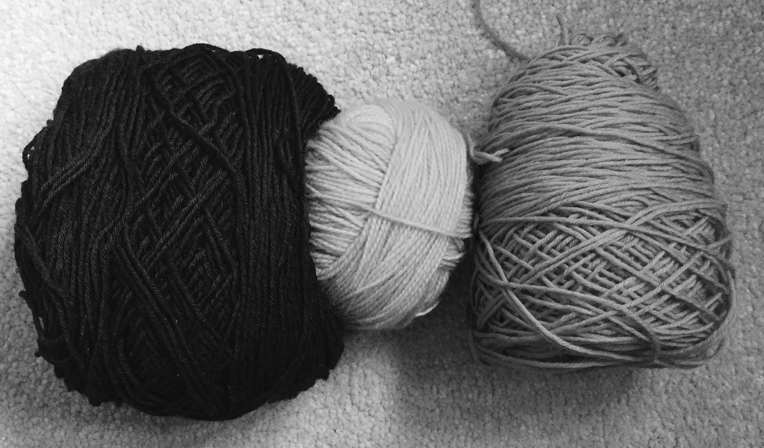
These are the three yarns I chose, as the three with the greatest contrast in value. You can see from this monochrome photo that the actual colours themselves can't really be distinguished, and actually they really don't matter. They could be black, cream and grey, as they appear to be here. Or they could be black, pale blue and pink, or dark green, cream and lilac, or dark brown, yellow and peach. What makes them a good combination for colourwork is that they contrast well with one another.
There is also a warmth associated with colours. Warm colours, those based on reds, yellows and oranges, can appear to advance towards you, as can brighter colours. Cool colours, the blue-based and green-based ones, can recede into the background, as can darker colours.
I wanted to choose a lighter, brighter colour for the areas that I wanted as the foreground of the colourwork design and the coolest colour for the background.
So what was this combination of colours?
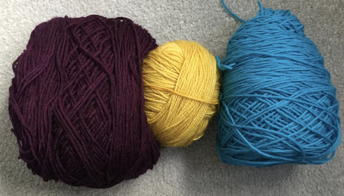
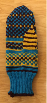
Here is the original colour photograph! Did you guess? A deep red-purple, a yellow, and a turquoise blue were not a combination I would have chosen based on the colours themselves and I've been really surprised to find how well they have played together in the mitten pattern. The design will be revealed soon enough, but for now, here is how they work together on the palm of the mitten.
What unexpected colour combinations have you found recently?
 RSS Feed
